Friday, December 31, 2010
Vol. Energy Drink
One of the most expensive and strenuous assignments for college from this year (2010) was my Energy Drink.
The assignment was to create a brand for an energy drink, package it, photograph it, and literally make it.
My inspiration was music, because music symbolises energy. I named my brand 'Vol.' which also relates to music, as well as the visual additions; the well-known volume logo, and the knob like O, all play an important part. I made my can silver and used reds, pinks and blacks for the design of the music waves and beat levels. I tried to make it look as universally acceptable as possible, not being stereotypical or gender-specific. The nice thing about my can is that, everyone knows without a shadow of a doubt, that music is what it's all about.
My brother helped me with the photography, and my mom and younger brother were my models.
As draining as this assignment was, it's by far the most fun I've had, when you look at something tangible that you've created in the space of two weeks, it's kind of mind-blowing and ego altering.
Sunday, December 26, 2010
Katy 'Grunge' Perry
Working on a personal assignment on Christmas eve has proven to be worthy. I took a picture of Katy Perry and grunged the hell outta it. With my increasing knowledge of Illustrator, it made the process a lot more enjoyable because it let me include elements I would usually leave out. This post is proof that there is nothing wrong with working on a public holiday, if this is the result :)
Sunday, November 21, 2010
String Lake - I Have To Use Earplugs
I found this pretty cool process to hone in on my Photoshop advertising skills.
Make your own random album cover:
To Do This
1 - Go to Wikipedia. Hit “random” or click http://en.wikipedia.org/wiki/Special:Random The first random Wikipedia article that comes up is the name of your band.
2 - Go to Quotations Page and select "random quotations" or click http://www.quotationspage.com/random.php3 The last four or five words of the very LAST quote on the page is the title of your first album.
3 - Go to Flickr and click on “explore the last seven days” or click http://www.flickr.com/explore/interesting/7days The third picture in the top row, no matter what it is, will be your album cover.
4 - Use PhotoShop or whatever to put it all together.
This is my process and the final concept...
I think I lucked out in all aspects; the band name, album title and cover were all awesome!
Friday, October 15, 2010
Durban Destruction!
So here is a picture I found from 2009 which I took from a friend's flat. It's of Durban harbour and surroundings and there was something burning in the distance. This was the inspiration I needed! I wanted to destroy Durban! Flaming buildings, smoke-filled skies, and planes plummeting from above. There are lots of small things I added into the image, like the lighthouse on the left or the car in flames on the street, and every element of the picture is made using photos from my own pc - no stock photography (kudos to me!). I really, really love this picture. It was my first attempt at digital painting and I can honestly say, I LOVE it!
Vintage Feel
Lately I've been playing around with editing photos, and I'm really getting into it!
This picture is of an intersection in Morningside. I really love altering the sky, it gives it a surreal feel.
Tuesday, September 21, 2010
Gaysian!
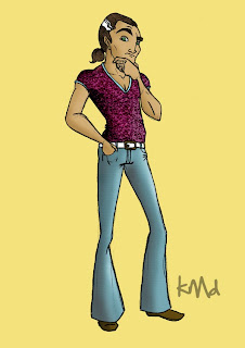 I'm not really sure where I got this idea from, I was bored one night, got out my pad and started doodling. The picture is ok, but it lacks any substance.
I did wanna attempt something new, so instead of using flat colours, I used a pattern overlay. I gave the jeans a rough texture and the shirt a very 'flamboyant' design.
I'm still playing around and getting comfortable with proportions - which is why his head is pretty large. ;P
Monday, September 20, 2010
Masters Of Lightning!
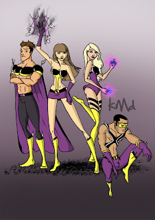
Superheroes! You can never go wrong with Superheroes. Each character has their own ability - I'm just not sure what it is, but at least they look pretty cool... and they're purple, purple is cool!
I kinda cheated doing this picture, it may seem like a group picture with all of them standing together, but each character was drawn in pencil separately, then positioned in a group on a new piece of paper in fine-liner, then scanned and then Photoshopped. It took a helluva long time, and great precision, but I was really excited about this one and I'm really glad it's done for everyone to see.
Lingerie Model
Sunday, September 19, 2010
Beach Bum
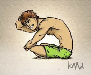 Spring is here, and Summer is near!
Time to get tanning like this beach bum.
I used the same sketchy, messy lines I used for a previous image I made, which I achieved by jumping the lightbox process. Using simple colours (my two favourites - green and brown) and adding subtle shadows and highlights.
It's funny how drawings sometimes work out. This one I doodled on a piece of paper I had lying around waiting to make coffee, and it turned out pretty great :)
Monday, September 13, 2010
8Bit Tetris Shoes
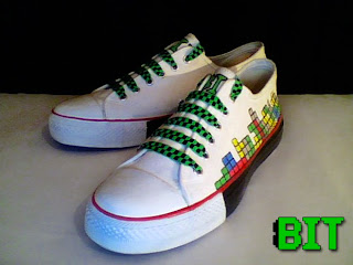
The new assignment I'm working on at Style Design College is creating a brand and using it to design a pair of shoes, while staying true to the brands origin, idea and audience.
I chose 8Bit as my label which gives me a broad spectrum to utilize. The flat colours and pixeled look of the images give off a nostalgic feel from the retro games of past years. Using Tetris as my design was a good choice because I was able to use a simple pattern, which has great impact.
The laces which I just luckily happened to have lying around at home, conform to the idea of the brand.
The only down-side to my shoes, is that they're one size too big for me. :(
Tuesday, September 7, 2010
Naked & Raw
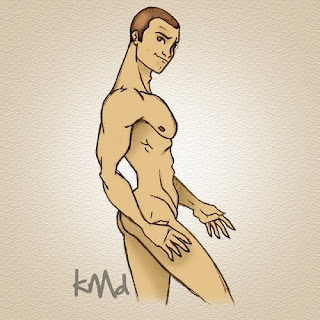 I scanned this picture before lightboxing... the result, one pretty schweet looking image!
The dark sketchy lines add to it's awesomeness. I can honestly say I had a blast with this picture, it was quick, simple, but oh so effective! Even the subtle shadows blended greatly.
I added a textured background for a raw touch.
Friday, September 3, 2010
Dark & Broody
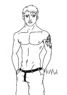
This boy's got secrets.... He's got that look that says he's trouble.
This one was quick and easy, the lighting and shadows were a bit tricky cos I tend to forget where the light is coming from, and also because I really enjoy creating shadows and I sometimes go crazy. Overall, it was a success :)
One thing I would've liked, is to have added more detail to his hair, it looks a bit dull and uninteresting.
Gamer Chick
Monday, August 16, 2010
Powerless Hero
Friday, August 6, 2010
Homophobia Hurts
Thursday, August 5, 2010
Denim Ghetto
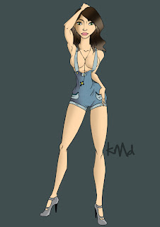
Around last year November I was pretty busy, because this one also comes from then.
It's very J.Lo with a bit of a naughty edge. Luckily though, there's no nip-slip going on!
I initially made her crotch rather 'manly and large', unintentionally of course, but much tweaking, flattening and sucking - kinda like plastic surgery - and voila! She has her womanly shape back.
A Storm's a-brewin'
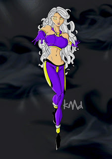
Storm. There's not much more to say about the character, everyone knows her from X-Men fame. Usually a black woman with a cape, I spiced it up by taking away her cape and making her caucasian. I spent a lot of time on her hair, adding shadows in certain areas, and considering her hair is so busy, it was something I'm not too keen to repeat.
I did this one in September last year, and also included it in my portfolio for my college application.
Angeline Jolie look-alike
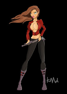 Now this picture I did a really, really long time. It was around the time when Wanted, the Angelina Jolie and James McAvoy movie came out. Obviously that's where my inspiration came from. Something in this picture which I rarely do because it's too difficult, is the smudging of light and shadows.
For most of my pictures I use clean, fine lines to part the light from shadows, where this picture uses smudges. It gives it a realistic look to it, but it can also go very wrong, hence why I prefer not to do it too often. You can notice it especially on her breasts (I'm proud of those knockers).
This specific picture took me 9 hours over 3 days!!!
Punk Rocker!
Friday, July 30, 2010
Beach Boy!
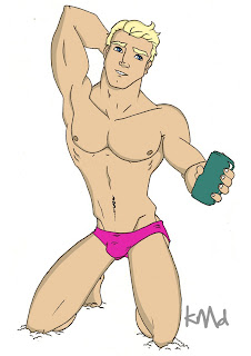
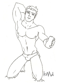 Gearing up for Summer, even though it's a few months away.
I've created a beach boy who is wearing the exact same pink hotpants that I have (except I don't look that good in them).
I really dig the sand effect I tried by his knees and feet. Perspective along with anatomy are things I'm trying out at the moment.
Bring on the sand, sun and surf!
Chesty Hero!
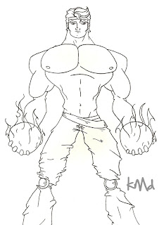
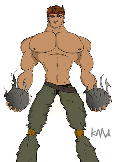
The bigger the chest, the better
 !
!I created a new character with an enormous chest - working with anatomy, trying to learn all the muscle groups proves to be rather rewarding.
The arms were also a tad bit difficult but came out ok-ish.
Don't ask me what the two smoking, boulder type rocks are in his hands. I battled doing his hands so I decided to hide them... hey, I'm still learning. ;)
Sharktopus!
Thursday, May 27, 2010
Brother Worth Knowing
Bagged!
Tied Up!!!
Tuesday, May 25, 2010
Uber Cool Photoshop Effects :)
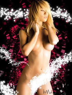
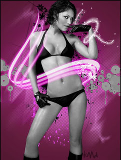
These are from early 2008, when I was still relatively new to Photoshop. Playing around a bit with brushes, blending effects and getting comfortable with the polygon tools.
One thing I battled a bit with was removing the underwear off the one model and placing her hair behind the glowing lights. But after many hours and tons of layers, SUCCESS!!!
Living Dead!!!
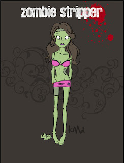
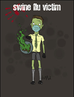
During the whole Swine-flu craze, I was inspired by a group of primary school kids walking to school with masks over their mouths to protect themselves. I then got a cool idea to do a whole collection of "the living dead", starting with the kid. I then proceeded to do a zombie stripper, but didn't really have the time to create anymore - maybe one day, but not now.
BRAAINNS!!!
Neon Rage & Busty Brunette
Subscribe to:
Posts (Atom)


