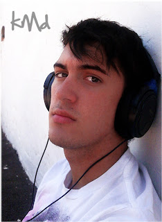
This is just a little image I put together in support of my blog. There's real small details, so be sure to open the image to its full size. The small details are the line and dot patterns which are nicely visible if this is used as a desktop wallpaper. I didn't wanna spoil this image with my 'kmd' watermark so instead I just labeled it with my 'Strawberry Pizza' brand.
I'll be doing blog posts more often so keep checking back. :)
Saturday, January 29, 2011
Thursday, January 27, 2011
Picture Worth A 1000 Words
This image took me quite some time. In the completed image, you can see that it is entirely made up of my name in different fonts. It didn't fill out enough spaces so I took random text and pasted it in, which bridged a couple gaps. I finished it off with a gradient effect. The blue yellow red worked out nicely. It gave it a very sunset feel.
Thursday, January 20, 2011
3D Text CD Cover
So I recently got a new album, but I couldn't find a decent album art online, so i thought I'd create my own.
A simple CD cover with a 3D text effect.
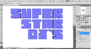
I started off in Illustrator, creating squares and removing sections to form the letters, spacing them proportionally.
Then, moving over into Photoshop, I duplicated the layer, enlarged it, lowered the opacity for visibilty, and started joining the bottom layer to the top one using the colour of the bottom layer. Sounds more complicated than it actually is.
Bringing the opacity back to it's 100% and changing the colour slightly gives the text it's full effect.
Small touch-ups might be necessary to make sure they look clean and on the same layer, even though they are two seperate layers.
I then got my dimensions for the CD cover, created a cool, party-like image which was not too over-powering.
Pasting the text into the image, changing the colour and adding a grunge effect to the lettering completes the CD cover.
Quick, simple and effective!
Here is another example I created using the 3D text effect:
Subscribe to:
Comments (Atom)


