Thursday, October 6, 2011
Nikita Header - TV Edge!
The CW show, Nikita, is in its second season airing in the states.
It stars Lyndsy Fonseca, Maggie Q, Shane West, Melinda Clarke and Xander Berkley. I do the graphics for tvedge.net and I wanted to use the new promotional pictures that were released for season 2 on the new header.
Using all these seperate images, I merged all of the characters into one image for the header.
Lots of blending, light fixes, cropping, cutting, dodging and burning and voila! A new header for the website.
You can also visit the site at www.nikita.tvedge.net
Tuesday, August 23, 2011
Zebra-Corn Shoes!
I designed a pair of Zebra-Corn (Zebra/Unicorn) shoes for my friend, Jessie-Lee's 21st birthday.
I bought a pair of plain white canvas shoes and first did my lines in pencil, then painted in the black zebra stripes. After that, I painted in the blue area around the lace holes and the red stripe on the back piece. Lastly, I painted the yellow front bit and painted the name on the shoe tongue.
I searched for the perfect pair of laces for the shoes and I figured purple and silver sparkly laces are better than plain lumo coloured laces. Gives it more of a 'unicorn' feel.
Lastly, I added a tag onto the shoes with a small card and a brand name for the shoes. I did the tag after I took the photos, so it's not included here.
This was a really fun pair of shoes to make, and it was quick and easy :)
Happy birthday Jess.
Thursday, August 11, 2011
Plants Vs. Zombies Pot plant!
She's a big fan of the game and bringing the concept together in a simple way produced good results.
I used a polystyrene cup for the base, covered it with the clay which then hardened and lastly, I painted it, filled it with dirt and added the flower.
While doing the photos for my blog, my dog almost destroyed the flowers, luckily they weren't real.
Happy Birthday Jo!
Friday, July 22, 2011
Ofentse Website
I recently completed the website for Ofentse, a singer in South Africa. Along with his website, I also created his Twitter, Youtube and Myspace page images. This website was the first I'd ever created, and was surprisingly easy. His full site can be viewed at iamofentse.com.
Friday, July 8, 2011
Moses Mabhida Stadium! (Mountain Range)

This is an image my brother took of the Moses Mabhida Stadium in Durban which was built for the Fifa World Cup 2010. Originally, the picture was a shot of the parking lot, stadium and buildings surrounding it and in the distance. I changed it up a bit, by removing the buildings and replacing it with a backdrop of a mountain from Underberg.
I also had to remove a couple of people from the foreground because they were kinda in the way, and made it look messy.
The main focus is the great change in scenery. Durbans stadium looks very different in a new setting, really cool, and I imagine an awesome view from the top of the mountain during sport events or concerts.
Monday, July 4, 2011
Less Is More: DaddyBoy Records & Endlovu Entertainment.


These are two logos I designed for a client earlier this year, I forgot to upload them and found them yesterday floating around my some files on my pc.
They were pretty simple concepts and didn't take much effort, I just kept telling myself; less is more. I also based a few ideas around the stuff I learned about typography in college last year.
Wednesday, June 22, 2011
Durban July!


Zip-Code Clothing recently released their Durban July dresses and Studio Twenty706 did the photography.
I borrowed a few pictures of one of the models and thought I'd play around with the images and give them character, giving them a theme based on the dress.
Friday, June 3, 2011
Almost Naked Chicks - Pencils
These are two drawings I started recently.
The first one (the naked girl with the towel) is my pencil lines, and the second one is my fineliner. The third image (the almost naked superhero) is just pencil lines. I really wanna finish these drawings but i can only do so once I get myself a scanner, and hopefully a graphics tablet. I think I'd have a lot more fun with my drawings if I had one of those.
Anyway, these will be completed soon... hopefully. :)
Saturday, April 2, 2011
Disaster Hits New York!
Oh look! A plane crash in New York City!
Nothing new or out of the ordinary, but with such a skyline and perfectly tall buildings just asking to be barged in, New York is the perfect location for some Photoshop manipulation.
Maybe it's my fascination for disaster movies or the strange excitement I get from hearing about a tragedy, but I love creating scary situations - especially when the viewpoint is the centre of it all.
My previous post a few months ago, Durban Destruction, is also a good example.
I created this image with focus on the plane and used a zoom blur to draw your eye towards it. I didn't wanna use a dark, sinister setting, as in reality a plane crash can happen anytime of the day.
Thursday, March 31, 2011
TV EDGE Website Launch & Graphics
TV EDGE website launches on 1st April 2011!
A site that features the latest and most up-to-date news of awesome new TV shows, such as Hawaii Five-0, Falling Skies, Terra Nova, Nikita and lots more. Grown from what was previously a collection of smaller blogs, has turned into a neatly organised information source of todays TV shows worth watching.
The site layout was created by manic-creations, and I created the site graphics. Two months planning and preparation has birthed a fully fledged site which is updated daily.
T-shirt designs of the TV shows has kept me busy as well, with constant tweaks and additions to make the shirts as perfect as can be. Every little detail was taken note of, to make the site and shirts satisfactory to the eyes.
Remember to keep checking TVEdge.net for your daily dose of TV show related information
Thursday, March 24, 2011
The Best Month (In My Opinion) Is April
Honestly, who can argue? April is a great month. It's not too hot or cold, there's no Christmas buzz driving people insane. Everyone has settled into the new year with their new jobs, and have come to the realization that the year-long gym membership you purchased in January, is not gonna do anyone good.
It's also Easter, and who doesn't love Easter?! Chocolates in abundance.
But now for the real reason why April is so awesome, it's my birthday month! Finally, I'm turning 21 and I'm entering the dreaded adult years, where people take me seriously and I gotta start taking charge of my life. Exciting yet daunting at the same time.
I created a cool glittery, swoosh text image to celebrate this awesome month, and will even use it as my wallpaper for all 30 days of April.
Everything Looks Better In 3D
3D! I recently learned how to create 3D images, the old-school type obviously, which require the red and blue (anaglyph) glasses. I searched all the local dvd stores and supermarkets, but I couldn't find the glasses. It seems all movies are either the new style 3D or are normal. I will eventually test out these images once I get a pair and use the 3D properly, but in the mean time, here are three images, which should capture the 3D essence nicely.
Saturday, January 29, 2011
Strawberry Pizza Smoke! - promo
This is just a little image I put together in support of my blog. There's real small details, so be sure to open the image to its full size. The small details are the line and dot patterns which are nicely visible if this is used as a desktop wallpaper. I didn't wanna spoil this image with my 'kmd' watermark so instead I just labeled it with my 'Strawberry Pizza' brand.
I'll be doing blog posts more often so keep checking back. :)
I'll be doing blog posts more often so keep checking back. :)
Thursday, January 27, 2011
Picture Worth A 1000 Words
This image took me quite some time. In the completed image, you can see that it is entirely made up of my name in different fonts. It didn't fill out enough spaces so I took random text and pasted it in, which bridged a couple gaps. I finished it off with a gradient effect. The blue yellow red worked out nicely. It gave it a very sunset feel.
Thursday, January 20, 2011
3D Text CD Cover
So I recently got a new album, but I couldn't find a decent album art online, so i thought I'd create my own.
A simple CD cover with a 3D text effect.
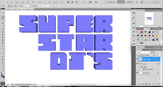
I started off in Illustrator, creating squares and removing sections to form the letters, spacing them proportionally.
Then, moving over into Photoshop, I duplicated the layer, enlarged it, lowered the opacity for visibilty, and started joining the bottom layer to the top one using the colour of the bottom layer. Sounds more complicated than it actually is.
Bringing the opacity back to it's 100% and changing the colour slightly gives the text it's full effect.
Small touch-ups might be necessary to make sure they look clean and on the same layer, even though they are two seperate layers.
I then got my dimensions for the CD cover, created a cool, party-like image which was not too over-powering.
Pasting the text into the image, changing the colour and adding a grunge effect to the lettering completes the CD cover.
Quick, simple and effective!
Here is another example I created using the 3D text effect:
Subscribe to:
Comments (Atom)


